Case 06 / 12

Fintech / Digital Wallet

Tweeq

Rebranding a Saudi Digital Wallet for a New Generation

Saudi Arabia
Tweeq Saudi digital wallet rebranding case study by Minto

Project snapshot

Minto repositioned and rebranded Tweeq as a youthful Saudi digital wallet across strategy, naming development, identity, packaging and digital experience.

Scope

Brand Strategy

Naming/Renaming Development

Brand Identity

Art Direction

Packaging

Website & App UI/UX

Photography

Campaigns

Activations

01

About Tweeq

Founded in 2020, Tweeq is a Saudi digital wallet built for a new generation of customers. Its ambition was to make everyday financial experiences feel faster, simpler, and more relevant to Gen Z and Millennials. As the company evolved, it needed a stronger brand system—one rooted in Saudi identity but designed to compete with global fintech platforms. The rebrand transformed Tweeq from a functional payments product into a confident, youth-focused financial brand, connecting strategy, identity, digital experience, card products, launch communications, and creative production under one unified direction.

02

The Challenge

The challenge was to build a fintech brand that felt unmistakably Saudi without relying on familiar cultural clichés. Tweeq needed to earn trust in a category where security and reliability are essential, while still feeling bold, approachable, and relevant to younger digital-native audiences. The system also had to work beyond a logo. It needed to connect the wallet experience, physical cards, packaging, campaigns, social content, photography, motion, and product launches within one recognizable brand world.

Tweeq branding case study
03

The Identity Concept

The identity takes its inspiration from the Tuwaiq mountains—one of Saudi Arabia’s most recognizable natural landmarks and a symbol of resilience. Two harmonious peaks form the foundation of the mark, while a third connecting element acts as a bridge and a rising indicator of progress. The lowercase wordmark adds warmth and approachability, balancing the confidence of the symbol. The result is a distinctive mark that communicates local roots, movement, originality, and growth without becoming literal.

04

The Brand System

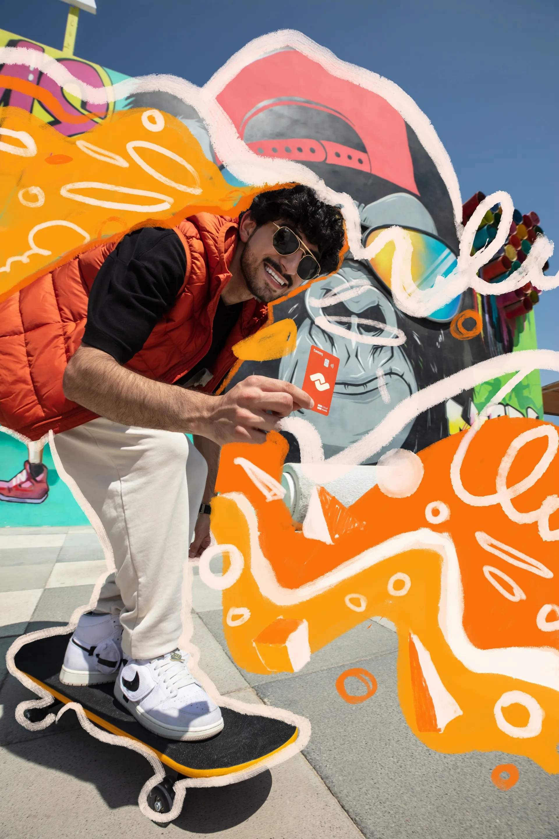
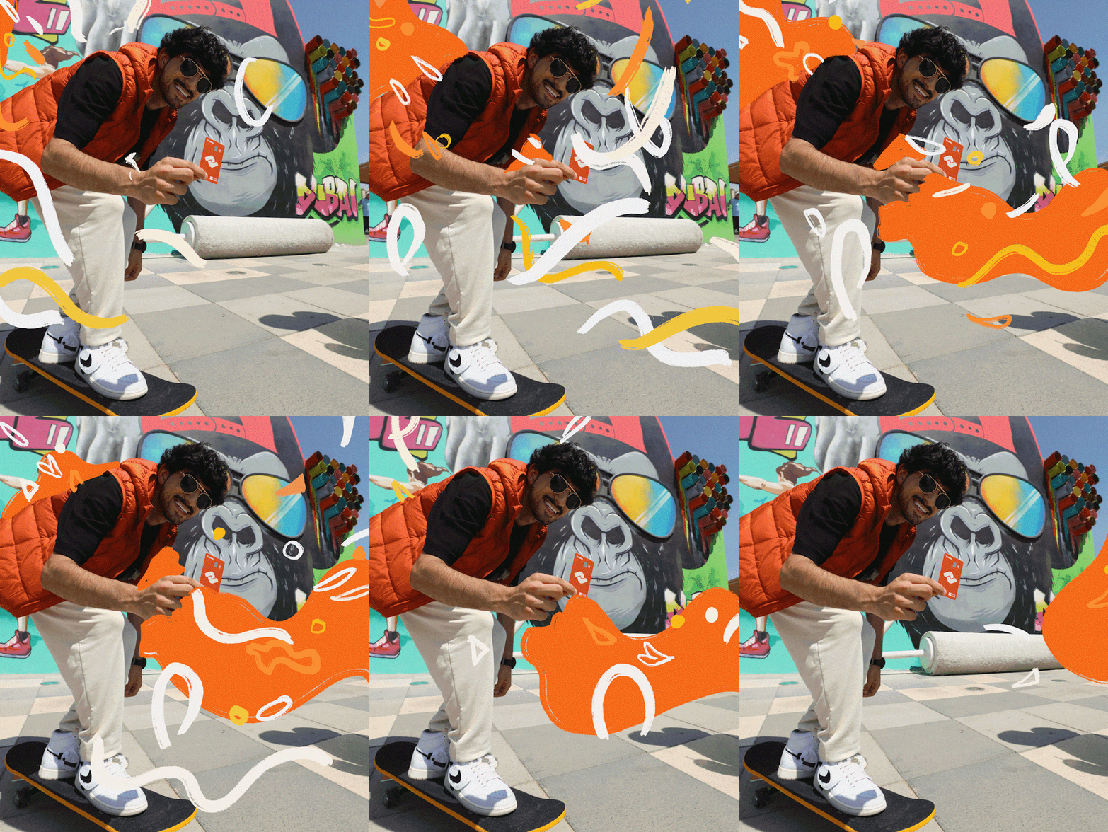
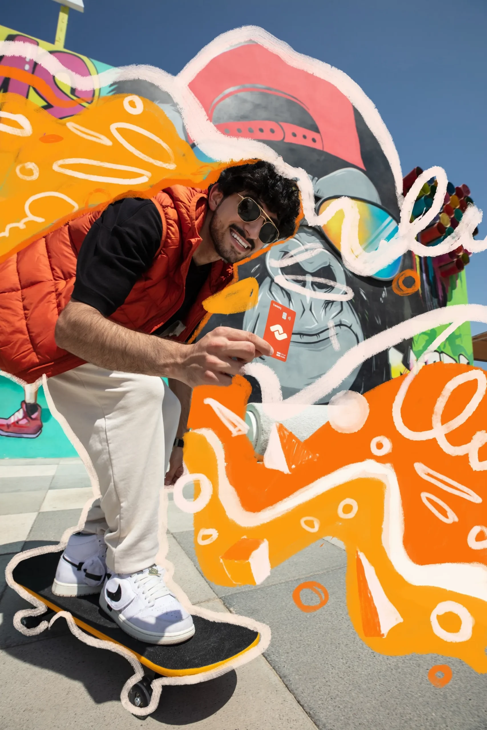
The visual direction combines boldness with friendliness. A vibrant orange palette brings energy and instant recognition, while confident typography and clean layouts keep the financial experience clear and trustworthy. Flexible graphic elements, expressive imagery, and motion give Tweeq a youthful personality across digital touchpoints, cards, packaging, campaigns, and social content.

05

Digital Experience & Motion

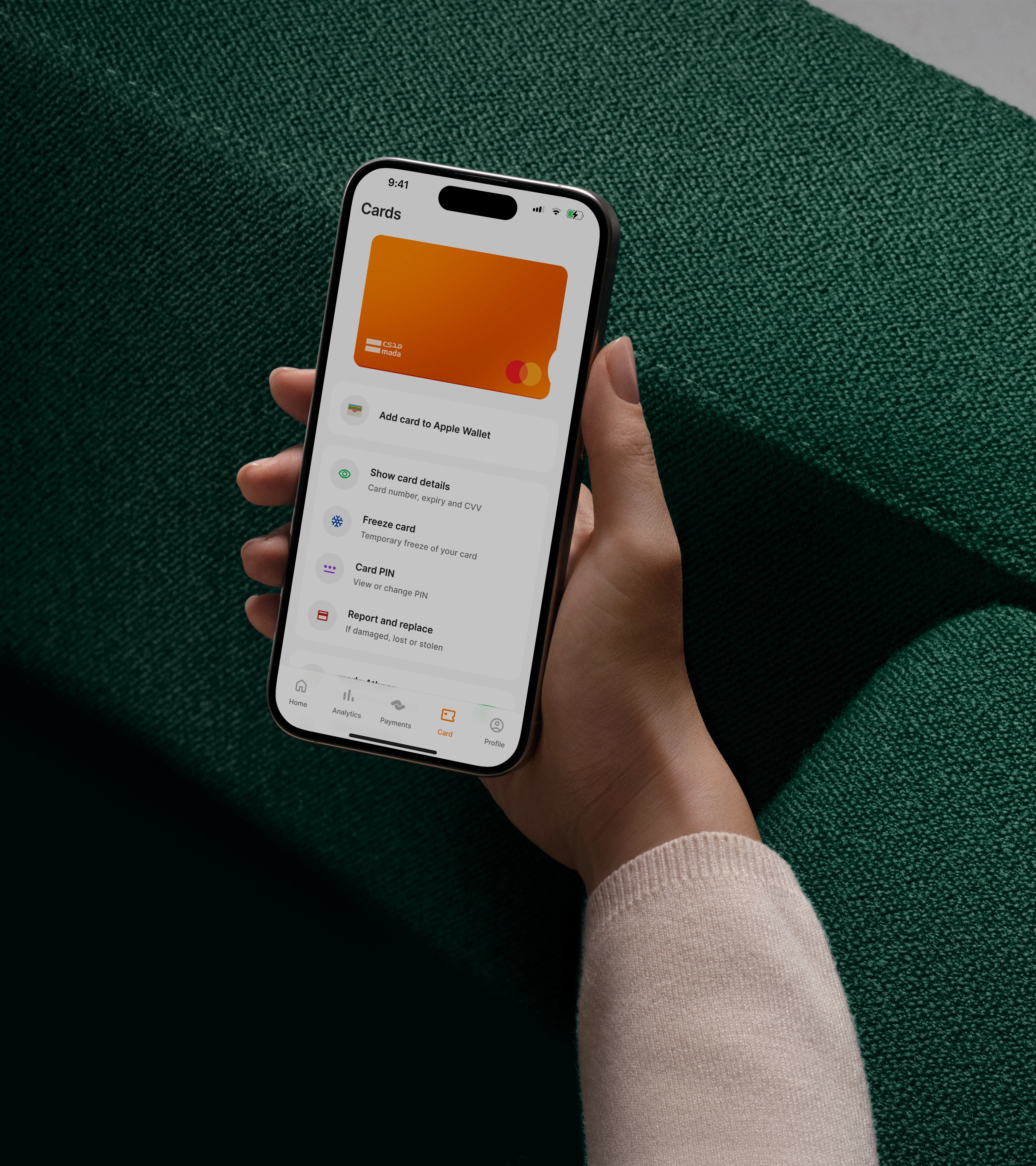
The digital experience was designed around speed, simplicity, and control. The interface makes everyday actions—from payments and transfers to analytics and card management—feel intuitive and visually connected to the brand. Motion extended that experience beyond the app. Logo animations, product films, feature demonstrations, and social assets gave Tweeq a dynamic visual language built for a mobile-first audience.

Tweeq branding case study
06

EDGE: A New Card Experience

EDGE was created as a premium lifestyle product within the Tweeq ecosystem, inspired by Saudi Arabia’s Edge of the World and the dramatic formations of the Tuwaiq mountain range. The card’s flowing lines translate the landscape into a tactile product expression. From the card design and packaging to 3D reveals and launch films, EDGE brings together financial utility and a distinctive sense of place.

Tweeq brand identity project visual
Tweeq branding case study
07

The Outcome

The rebrand gave Tweeq a unified identity capable of moving confidently between fintech product, youth culture, and Saudi innovation. The rebrand built strong recognition with younger audiences in a short period, with the packaging and visual identity generating organic sharing and conversation.

Tweeq brand identity project visual

The delivered outcome

A bold, recognizable fintech system designed for mobile product, physical cards, campaigns and youth-facing activations.

03FitLabNext case study